Clustering
For this tutorial we will use the dataset of Bogdanovic et al., 2012. This paper describes dynamics of the enhancer epigenome during zebrafish development. The data is located in /data/devcom/bam/zebrafish and is mapped to the zebrfish genome Zv9 (UCSC: danRer7). These BAM files are ChIP-seq experimints of two enhancer-associated histone modifictions, H3K4me1 and H3K27ac, in four developmental stages (dome, 80% epiboly, 24 hours and 48 hours). While H3K4me1 is associated with enhancers, H3K27ac seperates active from poised enhancers (Creyghton et al.).
Supplemental tables S19-S22 from Bogdanovic et al., 2012 contains putative enhancers for all four developmental stages respectively.
- Convert these tables to BED files and created a merged BED file of all enhancers in all stages.
Now, we will cluster the enrichment profiles of H3K4me1 and H3K27ac around these enhancers and create a heatmap of the results. There are many options for both clustering and visualization. If you want more fine-grained control, your best bet may be either Python, with the Pycluster and matplotlib libraries, or R with the heatmap.2 function from the gplots package. In this tutorial we will use fluff to illustrate the basic concepts.
Clustering ChIP-seq data takes time, so we will select a small, random subset of the enhancers to try out the clustering.
$ shuf zv9_enhancers.bed | head -n 2000 > zv9_enhancers_subset.bedReplace
zv9_enhancers.bedwith the name or your own file that you created in exercise 1.
Using this file you can generate a basic heatmap with the following command:
$ fluff_heatmap.py -f zv9_enhancers_subset.bed -d /data/devcom/bam/zebrafish/H3K4me1_dome.bam,/data/devcom/bam/zebrafish/H3K4me1_80epi.bam -o test_cluster.pngThis will use the regions in zv9_enhancers_subset.bed to generate a heatmap, plotting the enrichment of the reads in /data/devcom/bam/zebrafish/H3K4me1_dome.bam and /data/devcom/bam/zebrafish/H3K4me1_80epi.bam and save the output to an image called test_cluster.png. You can basically name the image however you want. Transfer the png file that you created to your computer and view it. You can see that (by default) the program didn't perform any clustering at all. It just created a heatmap.
Now, before we continue, we will simplify the command a little bit, by creating symbolic links to all our bam files. You can think symbolic (or *soft) link as a kind of shortcut.
for bam in /data/devcom/bam/zebrafish/*.bam
do
  ln -s $bam
done
$ lsH3K27ac_24hpf.bam H3K27ac_80epi.bam H3K4me1_24hpf.bam H3K4me1_80epi.bam
H3K27ac_48hpf.bam H3K27ac_dome.bam H3K4me1_48hpf.bam H3K4me1_dome.bamNow we can shorten our previous fluff_heatmap.py command.
$ fluff_heatmap.py -f zv9_enhancers_subset.bed -d H3K4me1_dome.bam,H3K4me1_80epi.bam -o test_cluster.pngTo perform clustering you can choose from two types of clustering with the -C argument. For hierarchical, choose -C hierarchical (or -C h) and for kmeans choose -C kmeans (or -C k). If you choose kmeans you also have to choose the number of clusters, for instance -k 5 for five clusters.
There are two distance metrics implemented in fluff, Euclidean and Pearson. Default is Euclidean, alternatively you can use the Pearson distance metric on the peak center enrichments using -M Pearson -g.
You can change colors with the -c. For instance, -c blue,blue,green,green would color the first two datasets blue and the second two green. Use the same color for the same histone modification.
Finally, you can set the scale for visualization with -s. For instance, -s 90% will set the maximum of scale at 90% of the highest value.
- Use
fluff_heatmap.pyto identify patterns of enhancer dynamics using all zebrafish H3K4me1 and H3K27ac datasets. Try the different clustering types and distance metrics. What do you think gives the best results? Also try kmeans with different numbers of clusters. Hint: use a Bash for loop. How many clusters do you think are present in the dataset? Try varying the scale, how does that influence the visualization?
- Have a look at Fig. 3A from Bogdanovic et al., 2012. What are the differences between your clusters and these? Why are they different, can you figure out how these clusters were generated? Which method do you think is better?
Profiles
One way to visualize high-throughput sequencing data, like ChIP-seq, is as a heatmap. An alternative is as an average profile over a certain feature such as transcription start sites (TSSs), or genes. For instance, figure 1 (Akkers et al., 2009) shows the profiles of H3K4me3, H3K27me3 and RNAPII over the TSSs of X.tropicalis genes.
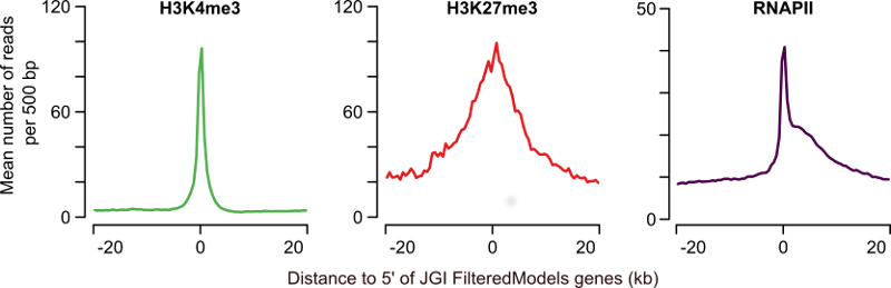
Figure 1: Profiles of H3K4me3, H3K27me3 and RNAPII at annotated genes. The average H3K4me3 read coverage for genes with a H3K4me3-enriched region within 1kb of the JGI FM genes annotated 5' end is shown in the left panel (mean number of reads per 500bp, green). The middle panel shows the equivalent for H3K27me3 (red) and the right panel for RNAPII (purple).
You can also generate these profiles for the different clusters that are shown in a heat map. There are several ways to produce these profiles:
- Choose one of the tools mentioned above to create average profiles of the zebrafish enhancer clusters, or for the X.tropicalis T-box dataset. If you have some Python programming experience, you can try
metaseq, which is a Python module. Thefluff_bandplot.pycommand fromfluffcan work withfluff_heatmap.pyoutput on the command line. The last option,deepTools, is a way to try out Galaxy, an online bioinformatics analysis platform.